Instagram was seen to launch a highly anticipated feature with video and music combination after the Chinese app, TikTok, was banned. Launched on both iOS and Android, Reels allows users to create short videos, up to 15 seconds long, with a huge catalogue of music to choose from. These videos are featured and discovered by all users while browsing the application. However, due to users’ complaints of not being able to easily search for Reels, Instagram has decided to redesign its app.
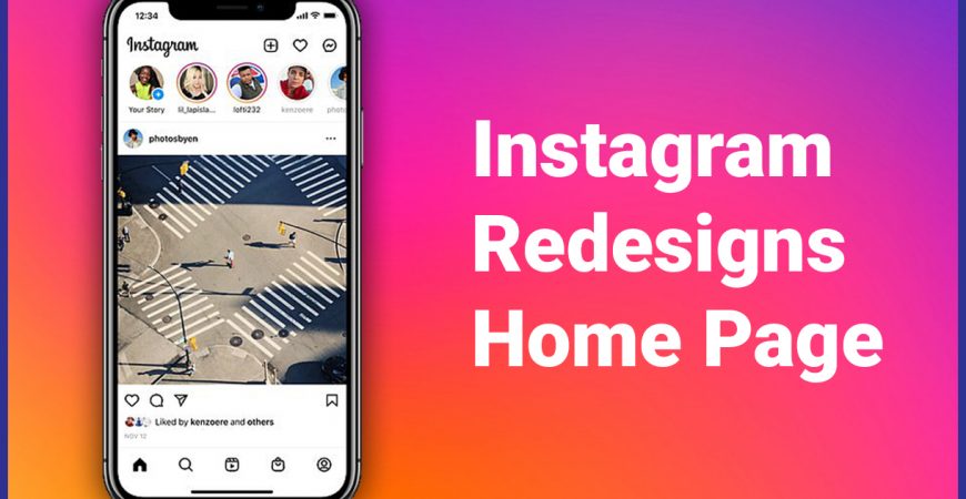
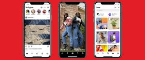
Instagram has decided to launch 3 different designs of the Instagram App’s home screen. The experimental redesign includes Reels added in the center of the app’s navigation bar. Furthermore, the shopping cart icon has also been added to the bar replacing the previous Activity icon. Both the Activity icon and Compose icon will now been on the top-right corner of the home screen. The redesigning is an aggressive attempt of Instagram to influence more users to use Reels.
Along with the placement change of the messaging icon, Instagram has further changed the design as well which now looks exactly like Facebook’s Messenger icon. If clicked, the icon directly takes the users to Instagram DMs along which is now directly connected with Facebook’s Messenger’s universe. The Shop icon takes the users to Instagram’s Shop page where it provides the functionality to filter categories by brands or products for better user-experience and for branding as an online shopping destination.
The users are not too happy with the new designs and the Reels functionality haven’t been a huge success for users so far. But as the users get their hands around the new designs, there is a potential of the Reels functionality on improvising and getting onto success as the new motive of the designs is to highlight the Shopping and Reels functionality.


 Local Stores
